Before we dive into the top aspect ratios for wall art, let's first understand what an aspect ratio is. In simple terms, aspect ratio refers to the proportional relationship between the width and height of an image or artwork. It is expressed as a ratio, such as 4:3 or 16:9, where the first number represents the width and the second number represents the height.
Why is aspect ratio important for wall art?
Choosing the right aspect ratio for your wall art is crucial as it determines how the artwork will fit and appear on your wall. An ill-fitting aspect ratio can result in a distorted or unbalanced look, while the right aspect ratio can enhance the visual appeal and harmony of the artwork.
1. Square (1:1)
The square aspect ratio is a classic choice for wall art. It offers a balanced and symmetrical look, making it suitable for a wide range of subjects and styles. Whether it's a landscape, portrait, or abstract piece, the square aspect ratio can create a visually pleasing composition.
2. Landscape (3:2)
The landscape aspect ratio, also known as 3:2, is commonly used for capturing wide vistas and scenic views. It provides a wider canvas, allowing the artwork to showcase expansive landscapes, cityscapes, and panoramic scenes.
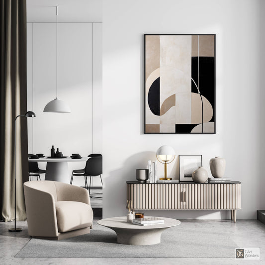
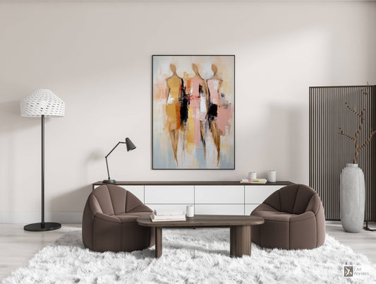
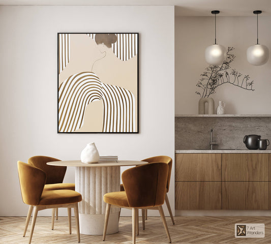
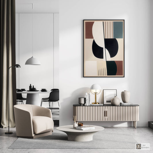
3. Portrait (2:3)
On the other hand, the portrait aspect ratio, with its taller height, is ideal for capturing vertical subjects such as portraits, tall buildings, or towering trees. It adds a sense of height and elegance to the artwork.
4. Panoramic (16:9)
If you want to create a cinematic feel or display a breathtaking panoramic photograph, the panoramic aspect ratio is the way to go. With its wide and elongated format, it can beautifully showcase wide-angle shots and immersive landscapes.
5. Golden Ratio (1.618:1)
The golden ratio, also known as the divine proportion, is a mathematical ratio that has been used in art and design for centuries. It is believed to create aesthetically pleasing and harmonious compositions. The golden ratio aspect ratio can add a touch of elegance and sophistication to your wall art.
6. Diptych (2:1)
The diptych aspect ratio involves splitting the artwork into two equal panels. It offers a unique and dynamic way to display your wall art. Diptychs can be used to create visual contrast, tell a story, or simply add an interesting visual element to your space.
7. Triptych (3:1)
Similar to diptychs, triptychs consist of three panels that are displayed together. This aspect ratio allows for even more creative possibilities. Triptychs can be used to create a narrative, showcase a series of related images, or simply make a bold statement on your wall.
8. Custom Aspect Ratios
Lastly, don't be afraid to think outside the box and experiment with custom aspect ratios. Depending on your artistic vision and the space you have, you can create unique and personalized wall art by choosing a non-standard aspect ratio that perfectly suits your style and preferences.
Remember, when selecting an aspect ratio for your wall art, consider the subject, the space where it will be displayed, and your personal aesthetic. By choosing the right aspect ratio, you can ensure that your wall art becomes a captivating focal point in your home or office.


